How To Write September In Calligraphy (8 Styles)
September - it marks the end of summer, but there's still so much excitement ahead. Back to school, Positive Thinking Day plus a whole hearty pallet of colors and food.
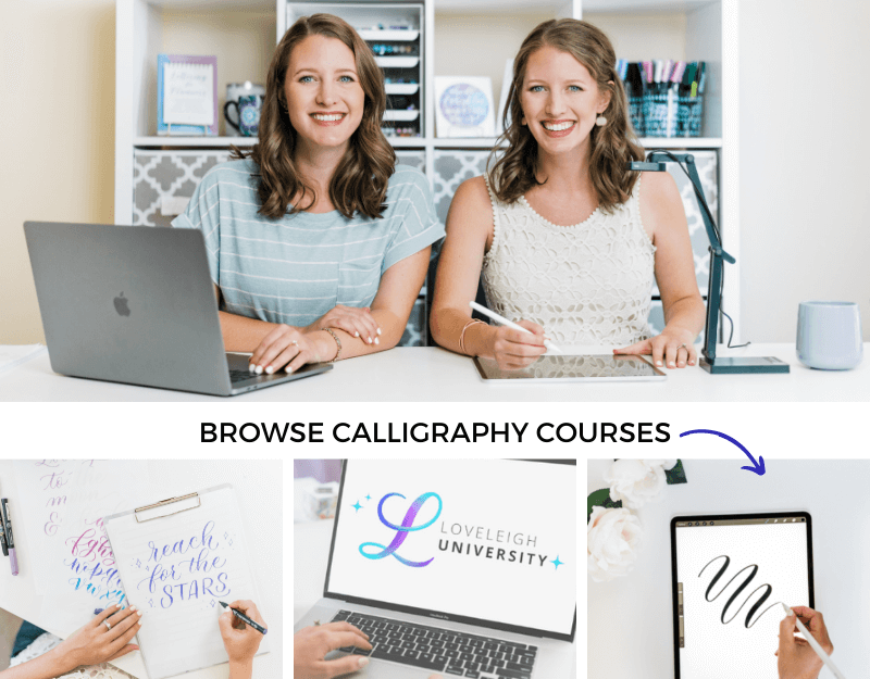
In this blog post, we're going to teach you how to write September in calligraphy.
This is a part of our month-by-month calligraphy tutorial series - click here for other months of the year! Let's dive in.
Pin it for later! ↓
Join the September lettering challenge for help practicing:
Table of Contents
September Letter By Letter
While calligraphy might look like cursive at first sight, they are different art forms. The difference lies in the way letters are formed. In calligraphy, each letter is made using a combination of the so-called basic strokes of calligraphy.
Rather than writing each letter in one smooth motion, a calligrapher draws one stroke at a time and lifts their pen after each one. Let's look at the basic calligraphy strokes that make up the word September.
Pin it for later! ↓

The Basic Strokes Of September
Instead of writing the word September, you really write the strokes in calligraphy. This is the foundation of calligraphy (but you can skip ahead to the "faux calligraphy" tutorial below if you'd like to learn a faster way to write September).
There are seven different letters in the word September. In calligraphy, you write them using the following strokes:
S: Entrance + half of an oval (crescent) with shading on the right side + exit stroke
E: Entrance stroke + (modified) underturn + hairline
P: Entrance stroke + full pressure stroke from 1st ascender to 1st descender + compound curve
T: Entrance stroke + long underturn that starts at first ascender + cross line
E: (again!) Entrance stroke + modified underturn + hairline
M: Overturn + overturn + compound curve
B: Entrance + ascending stem loop + underturn
E: (again!) Entrance stroke + modified underturn + hairline
R: Entrance stroke (that goes up above the header line and loops back down) + underturn

September basic stroke breakdown
When you string these strokes together to write the word, you'll need to slightly modify the strokes to form some of the letters in September. Although this may sound confusing at first, you'll see in our examples below how these modifications string your letters together seamlessly!
How To Write September
Now that we've covered the calligraphy basics, let's look at 8 different ways to write September.
Get even more tips when you follow along with our video tutorial:
Faux Calligraphy

Faux calligraphy
Looking for a way to write September in a way that looks like calligraphy without any fuss? Then this beginner-friendly style of hand lettering is perfect!
In faux calligraphy, you draw the outline of the shaded areas rather than actually making the thick downstrokes found in modern calligraphy.
When you write your letters, leave a little extra space in the places where shade is needed, like in these spots:
E: Don't close the underturn - instead leave a little room for shading
B: Keep in mind that you'll add shade to the left of the ascending stemloop so leave some extra room
Faux calligraphy is an easy calligraphy style to learn and the best thing about it? You can do it with any pen! Learn more in our guide:
If you want to move on from faux calligraphy to a real calligraphy style, then you'll need to get a brush pen, which takes us to our next example.
Brush Lettering

Brush lettering
With brush pens available in loads of different colors and sizes, brush lettering is a fun and colorful way to get started with modern calligraphy.
Where you added shading at a later stage in faux calligraphy, a brush pen lets you do it as you're writing. Simply press a little harder when you make a downward motion to get that beautiful flowing contrast!
You'll see that creating smooth transitions is hard when you're a beginner so we highly recommend using a few warm-ups or drills to get them just right. Use our free brush pen worksheets:
Beginner tip: The capital letter S in this example is a great way to practice your transitions since its larger size makes it a little more forgiving!
Bounce Lettering

Bounce lettering
Bounce lettering is a fun lettering style that you can create by changing just a few of the rules of the calligraphy game.
You add the bounce effect by dipping certain parts of the letters below the baseline and extending other parts above the headerline. The result is a style of hand lettering that looks very playful and casual.
Consider bouncing the word September in the following places:
M: Raise the second overturn a little and/or dip the underturn below the baseline
T: Dip the underturn below the baseline
R: Like the T, you can dip the underturn below the baseline
Learn more in our bounce lettering guide:
iPad Calligraphy

Bounce lettering is a fun lettering style that you can create by changing just a few of the rules of the calligraphy game.
Do you see how the letters change color in some places? Looking very closely, you might even see that letters change color in areas where they're shaded.
Our free Loveleigh Loops brush changes color when you apply pressure and lets you practice your transitions to perfection! Simply turn on your iPad, download and select the brush and you're good to go!
Download your free Procreate brush here:
Copperplate

Copperplate calligraphy
When you see elegant examples of calligraphy on Instagram or Pinterest, you're often looking at Copperplate calligraphy.
To do this traditional calligraphy style you'll need a pointed pen and ink as well as some quality paper. You can learn more here:
Flourished Copperplate

Copperplate flourishes
As a little bonus, let's look at a way to further embellish your Copperplate calligraphy word by adding flourishes.
Flourishes are decorative lines you can add to make your writing more spectacular and the month of September is a perfect opportunity to practice them! Try to add a flourish in:
Capital S: Uppercase letters are often great candidates for flourishing (especially when you balance September out with another flourish on the r)
P: Why let that thick downstroke go to waste?!
T: You can do all kinds of things with the t-crossbar
B: Works well to balance out a flourished P
R: Last letters often work well for flourishes. Extend the underturn with some decorative lines
Always remember to keep your flourishes from interfering with the legibility of your word. In other words, bigger is better!
Learn more in our free flourishing course:
Spencerian Script

Spencerian script
More restrained than Copperplate, the humble Spencerian style is an alternative choice for traditional calligraphy.
In general, letters are less rounded than in Copperplate. This becomes especially apparent when you zoom in on September and look at the letters e, m and b.
Additionally, the shading effect shows up a lot more sparingly. For the word September, there are only a few select spots where shade is added:
Capital S
Descender on the p
Upper stem of the t
Last stroke on the m
Learn more in our Spencerian tutorial:
Flourished Spencerian

Spencerian flourishes
Although Spencerian is a traditional script, you can use modern tools to write in it! Spencerian is beautiful when written on the iPad, and adding flourishes is even easier digitally. If you watched along in our video tutorial, you'll remember that this example was written on the iPad using the Procreate App.
When you're planning out your word, keep in mind that Spencerian is more restrained than Copperplate and this also applies to flourishing the word September.
Learn more in our flourishing tutorial:
Easy tip: don’t flourish as you go; instead, flourish at the end to make sure the spacing is correct.
Already signed up? Then all that's left is for you to start practicing!
Pin it for later! ↓

Next Steps
How do you feel about the change of seasons - does the cool air and changing color palette bring you to life, or do you long for the long days of summer?
There's no better time to feed a creative hobby than now. Start practicing today with our monthly lettering challenges.
And if you sign up from one of our free worksheets, keep your eyes out for invites to our live workshops! We're here to support you along your journey.
You may also like: