Brush Calligraphy Letters [A-to-Z Analysis + Free Printables]
At first glance, brush pen letters kind of look like normal cursive writing.
...then after a few practice sessions, you realize that your brush pen isn't cooperating and you can't replicate those perfect letterforms no matter how hard you try.
We know how frustrating it is when you can't replicate the brush lettering you in front of you! It’s a headache - and we have the remedy.

In this comprehensive guide, you're going to get answers to all of your brush lettering problems. Scroll on to see:
How to write lowercase brush letters
A-to-Z letter critiques showing common mistakes (and corrections!)
Letter variations for advanced brush lettering
Pin it for later! ↓

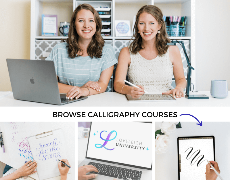
But first, a quick hello! We're Jordan and Jillian, the twin sisters and calligraphy teachers behind Loveleigh Loops.
We've been teaching both brush lettering and traditional calligraphy to students for years, both at in-person workshops (pictured below!) and to 40k+ students in 150+ countries through our online courses.

A throwback to our in-person workshop in 2017
And we couldn't be more EXCITED that you're here with us today. Let's dive in!
Psst… we’re going to start with some of the brush lettering basics, but if you’d like to skip straight to the alphabet just use the table of contents to jump there!
Table of Contents
What Is A Brush Pen?
Simply put, a brush pen is a special marker that has a flexible tip at the end. This flexible tip lets you make the thick and thin strokes necessary for the basic calligraphy strokes (we'll teach you these).
The most important thing for you to know is this: You create...
Thin lines by applying light pressure, and
Thick lines by applying heavy pressure
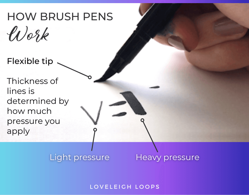
A quick explanation of how brush pens work
The amount of pressure that you need to apply varies based on the stiffness of the brush pen tip:
The more flexible your marker tip is, the less pressure you'll need to achieve this contrast
A hard tip requires you to use more pressure
A brush tip can come in two variations: a felt tip or a bristle tip. We go into the nuances of these in our brush calligraphy guide:
Easy tip: For beginners, we recommend using a larger felt-tip brush pen (like these) as it gives you a “zoomed in view” of the letters and teaches you pressure control; but as you grow your skills, try different pens and experiment!
One of the reasons we love brush calligraphy so much is that it's budget-friendly.
You can get most brush pens, including the popular Tombow Dual Brush Pens (what we use in many of our tutorials), at your local hobby store for about the same price as a cup of coffee.
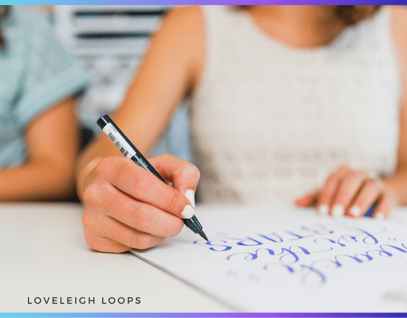
Jillian working on a brush lettering composition
If you want to learn more about the different brush pen characteristics, then check out our brush pen guide for a deep dive into the options on the market.
How To Hold A Brush Pen
When you start brush lettering, your first task is learning how to hold a brush pen the right way. The most important takeaway is that you hold a brush pen at a 45-degree angle to the page, and perpendicular to the direction of the stroke.
We explain this more in our video tutorial:
At this angle, your brush pen can make both a thin line as well as a thick stroke without ruining the tip of your pen.
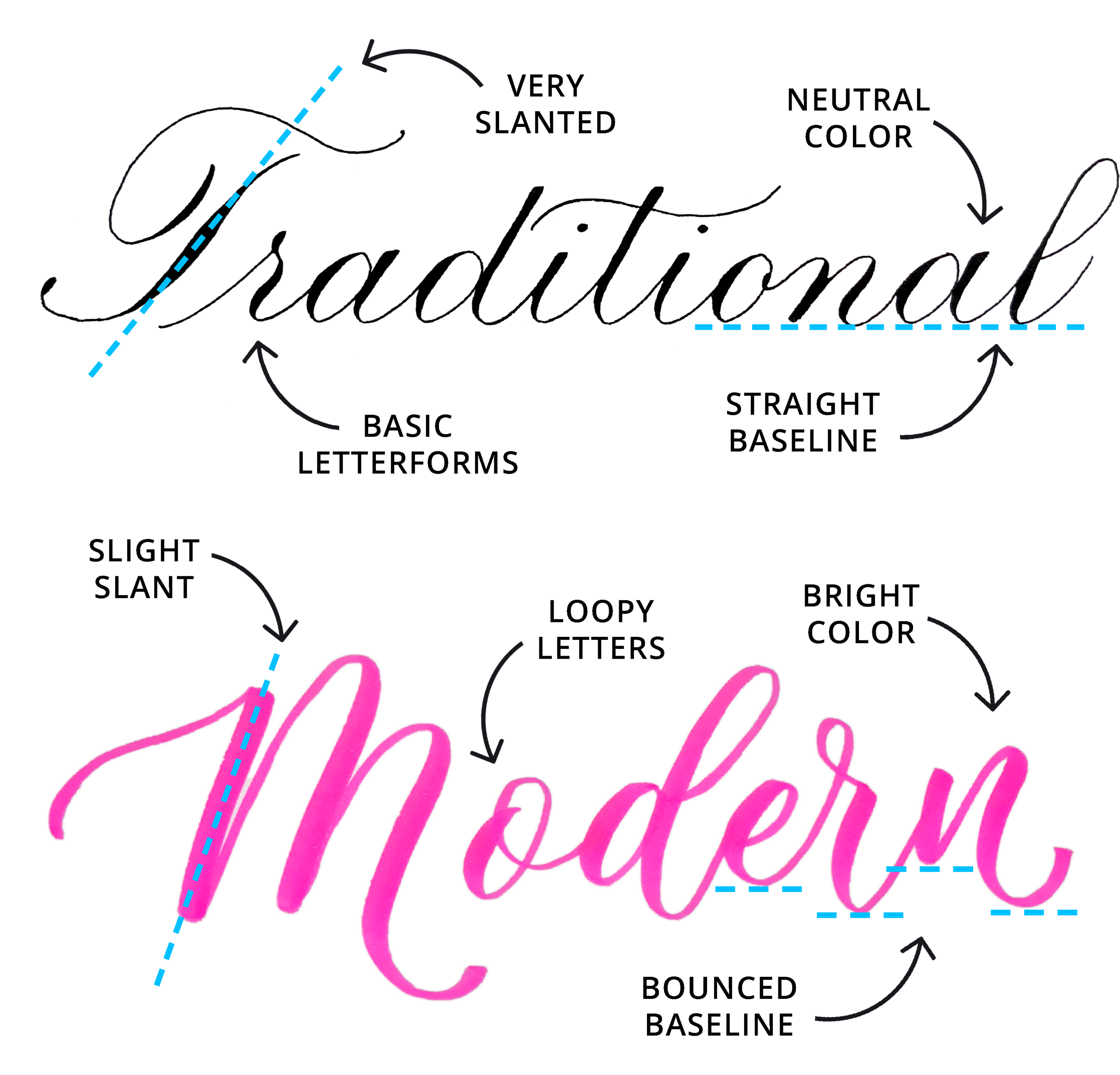
A brush pen is a modern calligraphy utensil, and there are a few important things to know about modern lettering before diving into this art form.
Modern Calligraphy Fundamentals
Calligraphy is steeped in tradition, and many calligraphers choose to still practice traditional scripts today with traditional tools like a dip pen (AKA a pointed pen).
When you see how elegant and timeless traditional calligraphy styles are, it's not hard to see why these scripts still have large groups of loyal followers.
>> Including us! We practice both traditional and modern lettering styles.
Modern lettering in general (and therefore brush lettering) is still firmly rooted in traditional calligraphy, which means that you need to understand the rules before you can break them.

Learn more about modern calligraphy in our guide:
Which rules, you ask?
The Brush Lettering Rules
There are fundamental rules that you must follow to get uniform brush letters. All letters must be:
Uniform in width and height
Written at the same angle
Built using the basic calligraphy strokes (we'll show you these in a minute)

Brush lettering alphabet
Breaking Those Rules
Brush lettering gives you the freedom to change every calligraphy rule (with the exception of the basic strokes) and this means you can do some really fun and creative things.
For example, you can:
Ignore the idea of letters resting on the baseline (make them bounce!)
Make your letters as angular or as round as you want
Have your letters jump off the page with 3D lettering
Freely experiment with color and blending
Break away from pen and paper altogether and embrace the possibilities of digital calligraphy
After getting the basics down, you can even create letter variations and create your own unique alphabet. Here’s an example of the letter s with different stylistic choices:

Letter s variations
This is the big-picture view of brush lettering. It's incredibly fun and creative, but before you can explore the creative depths of brush lettering, you need to master your letterforms.
Let's look at exactly how you write brush pen letters in their most basic forms.
How To Write Brush Letters
The process of doing brush lettering is very straightforward: write strokes then letters then words.
While getting started with brush pen lettering is significantly easier than pointed pen, there's still a natural learning curve involved. Let's start with the basic strokes.

Jillian writing with a brush pen
1. The Basic Strokes
Like all styles of lettering and calligraphy, brush lettering uses the basic strokes as the foundation for forming letters.

Basic calligraphy strokes explained
You'll hear us reference these strokes a lot. Their names are:
Entrance stroke
Underturn
Overturn
Oval
Compound curve
Reverse oval
Ascending loop
Descending loop
While practicing your basic strokes might seem a little boring, you're really building the muscle memory required to create your thin upstrokes and thick downstrokes.

We have an entire blog post on the basic strokes where you can find a breakdown of how to do them as well as a free basic strokes worksheet.
Easy tip: For beginners, it pays off to pay special attention to getting smooth transitions between thin upstrokes to thick downstrokes in your basic strokes. This small detail will have a big impact on your end result!
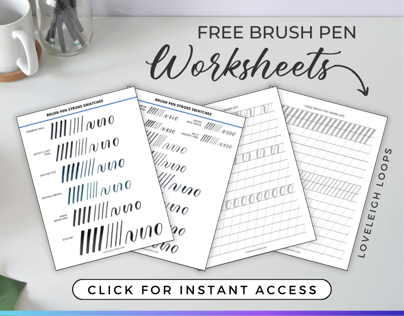
Practice with our free basic strokes worksheet:

Once you feel comfortable with the basic strokes, it's time to move on to basic letter shapes.
2. Basic Strokes Into Letters
As you'll see in our letter-by-letter analysis, taking the basic strokes and turning them into letters is very formulaic.
For example, the letter a is composed of three basic calligraphy strokes:
Entrance stroke
Oval
Underturn

In our a-to-z breakdown, we'll show you the strokes for each letter of the alphabet plus we'll zoom in on the letterform mistakes that make brush calligraphy letters look distorted.
Pin it for later! ↓

Easy tip: If you're brand new to lettering and calligraphy and don't have a brush pen yet, you can try your hand at faux calligraphy. Faux calligraphy is an excellent way to become familiar with letters and doesn't require any of the more advanced techniques (or tools) of calligraphy.
3. Letters Into Words
Just like you went from individual strokes to letters, your next step is to go from letters to words.

Turning basic strokes into words
You'll quickly see how you need control and flexibility in order to connect your letters smoothly. Sometimes, you'll need to extend an exit or an entry stroke in order to seamlessly move into the next letter.
With time and practice, you'll learn to anticipate and connecting letters will quickly become second nature!
Bonus: Brush Lettering Workbook
The easiest way to improve your brush letters is with guided practice in our workbook. It's a 25-page guide that covers:
Every lowercase letter of the alphabet in detail
Words and phrases
The capital letters

It also has dozens of reviews from happy customer (all verified on Etsy):
"These worksheets have improved my lettering skills more than any other worksheet/tutorial... It is 100% worth the money."
"This is a fantastic book... exceeded my expectations."
"Excellent product. More than expected."
In addition to the workbook itself, you'll also get access to our YouTube video series that walks you through the entire book. Get a preview here:
If you can't make a financial investment in your brush lettering skills, we also have dozens of free worksheets in our worksheet library!
Brush Letters A-to-Z
Together, we're going to go through all of the lowercase letters and look at:
Individual letter strokes
The complete letter forms
Common mistakes and corrections
If you'd like to watch these letters being written in real-time, watch our popular video tutorial:
Let's goooo!
A

Letter a tips:
Keep the lines of the oval parallel
Be mindful of the angle where the oval connects to the exit stroke
Extend the exit stroke to match the oval’s height
B

Letter b tips:
Don't bend the stem loop, keep it straight along your slant angle
Draw the shade of the final stroke downward instead of outward
Watch that your letter doesn't bulge out
C

Letter c tips:
Watch that the entrance stroke tapers into the half-oval instead of bending in or connecting too low
Mind the length of the little comma/dot
Don't let the exit stroke get too close to your half-oval
D

Letter d tips:
Watch the angle where the oval connects to the downward stroke — there should be gaps in between
Keep even pressure on your long underturn
Make sure your entrance stroke connects to the oval halfway up and not lower
E

Letter e tips:
Watch the angle of the shade so it stays along the slant
Don't add weight shade (weight) to the hairline finish (small loop of the e)
Lift your pen after the entrance stroke, before starting the e (don’t go straight into it)
F

Letter f tips:
Keep the ascending stem loop and the descender straight, not curved
Watch that your loops don't get too wide and bulge out
Don't add shade to the loops - keep upstrokes thin
G

Letter g tips:
Watch the connection where your oval attaches to the descending stem loop
Maintain angles of oval and descending stem loop
Extend exit stroke to the same height as the top of the oval
H

Letter h tips:
All strokes must be parallel
Watch that a huge gap doesn't appear between your ascending stem loop and compound curve
Maintain nice height on your ascending stem loop
I

Letter i tips:
Watch the height where your entrance stroke meets the underturn (not too low)
Avoid sharp angles occur in your underturn
Extend exit stroke fully
J

Letter j tips:
Maintain a medium-size loop
Watch that there's enough space left between your descending stem loop and the entrance stroke
Keep the top of the shade flat instead of angled
K

Letter k tips:
Strokes should be parallel and not leaning towards each other
Watch that the loop doesn't get wide and bulge out
In the delicate parts of the loop, maintain thin upstrokes and thick downstrokes
L

Letter l tips:
Lift your pen after the entrance stroke, before starting the ascending loop (don’t go straight into it)
The line should follow the 55-degree slant and not curve
Mind the angle where the entrance stroke meets the ascending stem loop
M

Letter m tips:
Start the “m” with an overturn, not a downstroke
Maintain a triangle shaped gap between the tops of the overturns
Finish the exit stroke of the compound curve as high as the overturns
N

Letter n tips:
Also start the “n” with an overturn instead of a downstroke
The second overturn should start at the baseline and smoothly taper away, instead of starting halfway
Keep strokes parallel and don't let wonky angles appear
O

Letter o tips:
The entrance stroke should taper in smoothly and not at an angle or too low
The comma dot should come on the side and not at the top
Keep the shade of the exiting stroke inside the oval
P

Letter p tips:
Maintain the 55-degree slant on the full-pressure downstroke
Square the end of the downstroke
Maintain rounded curves where the oval attaches to the downstroke
Q

Letter q tips:
Where the oval attaches to the descending stem loop, maintain the triangle shaped gaps
Extend the exit stroke to header line
Create a tapered oval when you bring the descending stem loop to the baseline
R

Letter r tips:
You can make a loop or a shade at the top of the letter
After making the extended entrance stroke, the shade or loop should come downwards rather than across
Maintain a thin upstroke on your extended entrance stroke and don’t extend it too far to the right
S

Letter s tips:
The top of an s can be a loop or a curve
The angle of the top of the s should follow a 55-degree angle
The top loop or curve should not be larger than the bottom half oval
T

Letter t tips:
Keep the t-crossbar thin and make sure it's not too close to the top
Watch that the entrance stroke doesn't join the stem too low
Focus on even pressure control on your long underturn
U

Letter u tips:
Maintain triangle shaped gaps between strokes
Keep the width of your underturns even
Fully extend your underturn exit stroke
V

Letter v tips:
Watch the angles of all your strokes to keep them along the slant angle
Keep the shade of the mini-underturn inside the final underturn (not to the right of it)
Make sure the bottom of the v is rounded and not pointed
W

Letter w tips:
Make sure the bottom of your strokes are rounded instead of pointy
Maintain smooth transitions between thin upstrokes and thick downstrokes
Keep the shade of the mini-underturn inside the final underturn (not to the right of it)
X

Letter x tips:
Don't make both strokes of the X thick - choose one stroke to be thick and one to be thin
Watch for uniform spacing
Make sure all of the strokes touch the baseline at the same place and aren't staggered
Y

Letter y tips:
Maintain a rounded compounded curve shape and not a pointed one
Watch the size of your descending stem loop
Make sure angles are parallel to the slant angle, especially the compound curve
Z

Letter z tips:
The descending loop shouldn’t come up above the baseline
Maintain a thin and even loop shape
Remember to lift between each stroke
Capital Letters
Learn the capital letters is the natural next step after learning the lowercase letters, and they present a fun additional challenge for lettering artists. There's more variation between capital letters, especially when you factor in all of the stylistic choices.
We won’t go through them all here, but we have a free A-to-Z capital letters worksheet and a YouTube tutorial where we write each letter in two styles:
We also teach the capitals in our workbook!
Fun Letter Styles To Try
Learning your lowercase letters is a huge accomplishment, and it's also only the tip of the iceberg when it comes to brush lettering. Once you've gotten them under your belt there are so many fun variations and styles to try.
Modern calligraphy is all about breaking the rules and finding your own style, so let's look at a few examples of this creative rebellion.
Bounce Lettering
Maybe the most playful of them all, bounce lettering is a super fun lettering style to try.
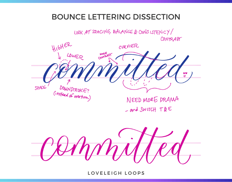
Bounce lettering dissection
With this style of calligraphy, we throw out the notion that every letter needs to rest on the baseline. Instead, we dip certain letters below it and extend other letters a little higher than they should go.
Easy tip: To get a sneak peek of this style, write a word and have every underturn dip below the baseline.
Learn the exact art of bouncing in our bounce lettering guide:
Letter Variations
The standard letterforms above are just the beginning of what's possible with brush lettering. You can create custom letterforms using letter formulas:

Brush calligraphy letter s with variations
This is from our Letter Logic course, sign up for instant access or try our free Letter Logic worksheet.
Ribbon Lettering
These beautiful ribbon letters are a great example of hand lettering - a type of lettering where you draw letters instead of writing them.
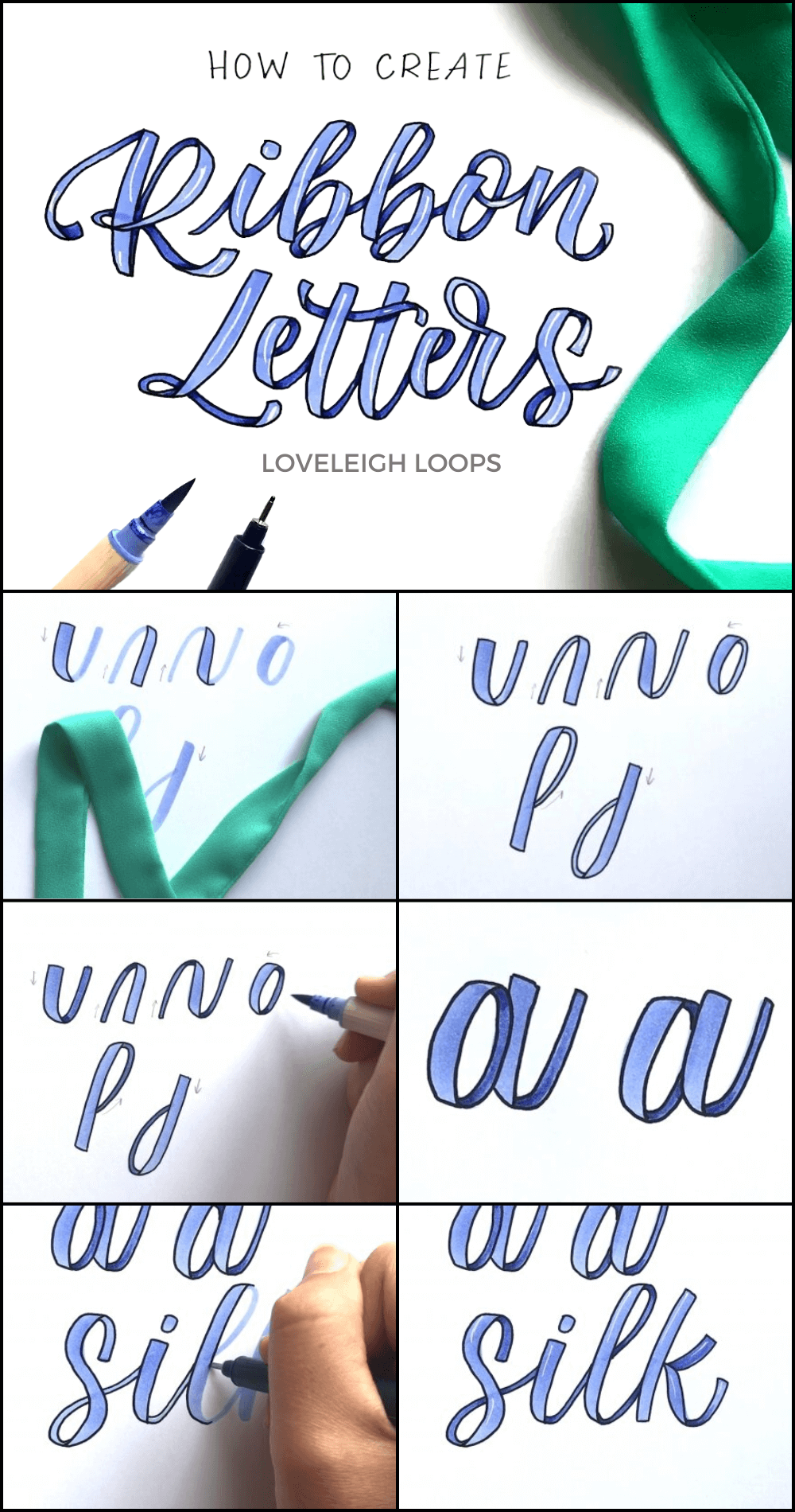
Using a brush pen, you write your desired letters, words or quote. Then, add outlines, deepen the shadows and add highlights!
For step-by-step instructions, see our ribbon lettering guide:
3D Lettering
Is the subtle ribbon effect not enough? Then give 3D-lettering a try! By playing with shadows and perspective, you can make your letters jump off the page even more.

These style incorporate some more advanced techniques to get the 3D effect but we encourage you to see for yourself if this style excites you and inspires your progress.
Check out our 3D lettering tutorial for the steps to do this type of lettering:
A Few Tips On Practicing Letters
All it takes is time and practice... you've heard it before, but what does it actually look like?
Knowing what and how to practice can shave a serious amount of time off the learning curve.
Let's go over some of do's and don'ts to see what good practice looks like!

Practice is important for every calligrapher - beginner or professional!
How To Practice
Practice often. You'll improve more if you practice 5-10 minutes a day than if you do one two-hour session per week. Just like any skill, learning brush lettering is largely a matter of taking the time to practice regularly.
When you sit down to pratice, always keep the following three things in mind:
Slow down: The goal is perfection, speed is irrelevant
Aim for consistency: A guide sheet helps a lot with making your letters of identical size and angle
Self critique: Always circle back to look at your work so you can spot areas to work on
Easy tip: For beginners, we recommend starting with large-tip brush pens so it’s easier to spot your mistakes. But if you’re really struggling with pressure control, you can use a smaller brush pen.

What To Practice
When you practice, it really helps not to overlook the basics of brush lettering. We recommend starting with the following warmup routine:
Thick downstrokes: Move the pen in a downward motion and apply pressure to create thick lines
Thin upstrokes: With lighter pressure, move the pen in an upward motion creating thin, straight lines.
Compound curve: The transition between thick and thin strokes is a great way to work on pressure control
While your practice routine will change as you become more proficient, taking a moment to revisit the brush lettering basics will keep your skills sharp! Use our free warmup worksheets:
After your basics are down, work on words and quotes. Join our daily lettering challenges or let our lettering prompt generator give you as many prompts as you’d like!
Choose The Right Paper
Don't practice your brush letters on just any paper. You’ll end up with a few surefire headaches:
Ruining your brush pen tip
Your ink bleeding across the page
Faded ink
Always use smooth paper. We commend Canson Marker Paper.
Next Steps
Whether it's your first day picking up your Tombow Dual Brush Pens or you've been doing brush lettering for years, we're so glad that you've joined us here at Loveleigh Loops!
Can we be lettering friends? We’d love to invite you to live workshops, share new worksheets and cheer on your progress.
We'd be thrilled to have you in our supportive student Facebook group where we run daily challenges and share materials.