
How To Write October In Calligraphy (8 Styles + Free Worksheet)
Nature puts on a show in autumn, and we're eager to soak it all in and put that creativity into our calligraphy. In this post, we're going to share 8 different creative ways to write October in calligraphy.
Use this tutorial for...
Seasonal decor and crafts
Your bullet journal
Just for fun!
Grab your writing utensil and paper and let's go.
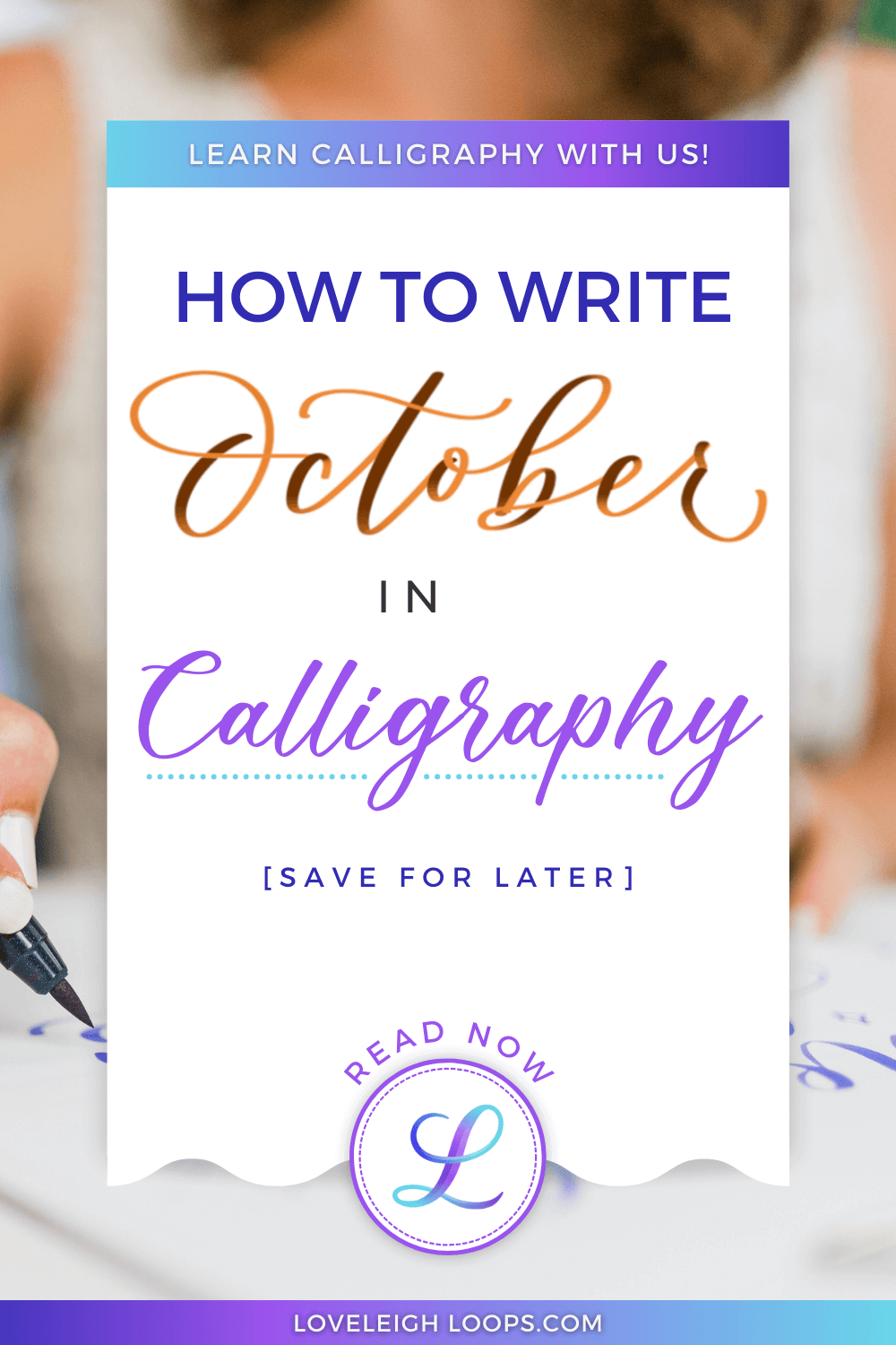
Pin it for later ↓
>> Join the October lettering challenge for help practicing <<
October Letter By Letter
Traditional calligraphy is written using the fundamental calligraphy strokes. Here are the specific strokes that make up the word October:
O = Large oval
C = Half of an oval
T = Long underturn that starts at first ascender + crossbar
O = Oval + comma dot
B = Ascending stem + underturn + comma dot
E = Half oval + hairline to finish
R = Entrance that goes up above the header line and loops back down + underturn

October’s basic strokes
Use entrance strokes to connect each letter to the next. You can learn these using our free basic strokes worksheet to practice:
October In 8 Different Lettering Styles
Calligraphy comes in so many variations and a quick Google search will get you plenty of lettering styles to try and explore! Let's look at some examples for the word October.
Follow along with our video tutorial for more writing tips:
Faux Calligraphy

Faux calligraphy
When you write your faux calligraphy letters, you can color the thick areas in completely or leave them hollow. If you want the hollow effect, you'll have to plan ahead a bit as you write in these areas:
E: Don't connect the hairline to the half oval
B: Leave a little space in your ascending stem loop
T: The crossbar needs to leave a little space
Faux calligraphy is great for beginners and we highly recommend checking out our tutorial on how to learn faux calligraphy or our free course:
Brush Pen Calligraphy

With brush pen lettering, you add shade as you're writing the letters. Simply press a little harder to create a thicker line and achieve that beautiful contrast.
As you're adding shade to your letters, try to make sure you don't overshade! Always make sure your thick lines taper before hitting the baseline to create smooth transitions.
If you’re not happy with your letter forms, read our letter-by-letter alphabet critique to troubleshoot:
Bounce Lettering

Bounce lettering
To achieve the lively bounce lettering style, consider changing the following letters in October:
O: Make it a little more open and dip the bottom below the baseline
T: Extend the thick line below the baseline and make the crossbar wavy
B: Opening the bottom loop lets you bounce it as well as create a more playful look
R: You have quite a bit of liberty with the last letter. Bouce boldly!
Learn the rules of this modern calligraphy style in our bounce lettering tutorial:
iPad Lettering

iPad calligraphy
As one of the most forgiving ways to learn calligraphy, the Procreate app is perfect for beginner practice and professional artwork alike.
Digital calligraphy is especially well-suited for learning pressure control. Download our color-changing brush to see your colors change with pressure change!
See if digital lettering is right for you in our paper vs digital lettering guide:
Copperplate

Copperplate calligraphy
In the world of traditional calligraphy, the historic Copperplate script is loved for its elegant lines and vintage beauty.
Aim for consistency in your letters and for a nice even between your thick and thin lines. We highly recommend using a specific Copperplate worksheet to help you write your letters at a consistent 55-degree slant.
See how to write the entire Copperplate alphabet in our letter-by-letter tutorial:
Flourished Copperplate

Flourished Copperplate
While Copperplate is already a beautiful script, you can make it even more elegant by adding decorative flourishes. Flourishes are tricky to get right, but when you do, they transform your composition!
Try embellishing October in the following places:
O: The first letter of a word is a natural place to flourish the entrance
B: Stem loops are generally great candidates
R: Use the exit stroke to add a little drama
Remember to always plan out your flourishes in advance with a pencil before writing in ink. Embellishing your words is all about balance so winging it means taking risks when you don't have to. See more beautiful examples in our Copperplate flourishing guide:
Spencerian Script

Spencerian script
Most modern calligraphy uses the Copperplate script as its foundation, but if you look closely, you'll notice that Spencerian letters are less round and there's significantly less shading. A little more refined and restrained, the Spencerian script is a great choice for pointed pen aficionados.
For the word October, you'll notice these shade differences in your letters:
The lowercase c, o, and e typically are not shaded
The shading on the ‘t’ should decrease, like an upside down triangle
Only the lower part of the ‘b’ is shaded (not the entire stem)
If you're interested in learning this classic lettering style, check out our beginner Spencerian tutorial:
Flourished Spencerian

Spencerian flourishes
Just like Copperplate, Spencerian can be flourished to add elegance and excitement.
Great places to flourish are the first and last letters of the word. Maintaining a sense of balance is important with embellishments, and you can see that these flourishes counterbalance each other beautifully.
Easy tip: Make sure your flourishes don't interfere with the legibility of your letters. In our October example, you can see flourishes interacting with both the c and the b, but the word is still readable.
Get worksheets in our free flourishing course:
Practice Tips
If you want to improve your lettering skills, it's important to understand how to practice effectively. When it comes to practicing calligraphy, we highly recommend the following:
Focus on one thing when you practice
Learn to self-critique
Use practice sheets
Practice often
Take it slow
Pin it for later ↓

How to write October in calligraphy
We have daily challenges going on every month that take the decision-making out of practicing. Join October's challenge here:
Easy tip: Save the link to our practice challenges in your browser so there are no slow-downs when you want to practice!
Next Steps
We're so glad that you joined us here for this month's tutorial, and we hope that you'll come back for the next one!
You can view our full list of monthly tutorials here, or use the links below to find exactly what you're looking for:
November tutorial (coming soon)
December tutorial (coming soon)
Make yourself at home here at Loveleigh Loops - we'd be thrilled to have you in our community :)