Tutorial: How To Write August In Calligraphy (8 STYLES)
Whether you're writing in your bullet journal, creating fun seasonal vectors for your digital art or you just enjoy practicing your lettering, this August tutorial is for you.
This is the latest installment of the months of the year tutorial (see all tutorials here), and we're so excited to teach you how to write August in calligraphy.
In this tutorial, we're going to teach you how to write August in 8 different styles.
We have deep-dive tutorials (and often a free worksheet or course!) for each of these styles, so make yourself at home here at Loveleigh Loops and let's jump in!
Pin it for later! ↓
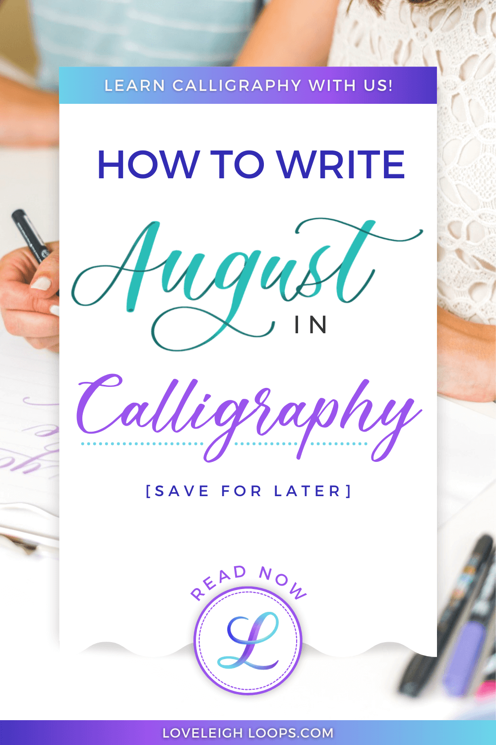
Table of Contents
Want more inspiration to practice this summer? Join our daily August lettering challenge!
August Written In Calligraphy - Letter By Letter
Before we dive into the different calligraphy styles for the month of August, let's take a quick moment to look at the word itself. In calligraphy, you create a letter using a combination of certain strokes. These strokes are called the basic strokes of calligraphy and they form the building blocks of every calligraphy alphabet.

The word of August consists of five different letters. For the sake of simplicity, we won't dive deep into the capital letters for today (we teach those here).
You can follow our capitals tutorial to learn the strokes of the capital calligraphy A, or you can watch our video tutorial (above) and follow along with us there.
Looking at the lowercase letters in order, we have the following strokes:
A - Entrance stroke + oval + underturn
U - Entrance stroke + underturn + underturn
G - Oval + descending stemloop
U (again!) - Entrance stroke + underturn + underturn
S - Entrance stroke + reverse oval
T - underturn + crossbar
Working on the basic calligraphy strokes is one of the best ways to learn calligraphy and we highly recommend that you check out our guide on the basic strokes! Download our free worksheet:
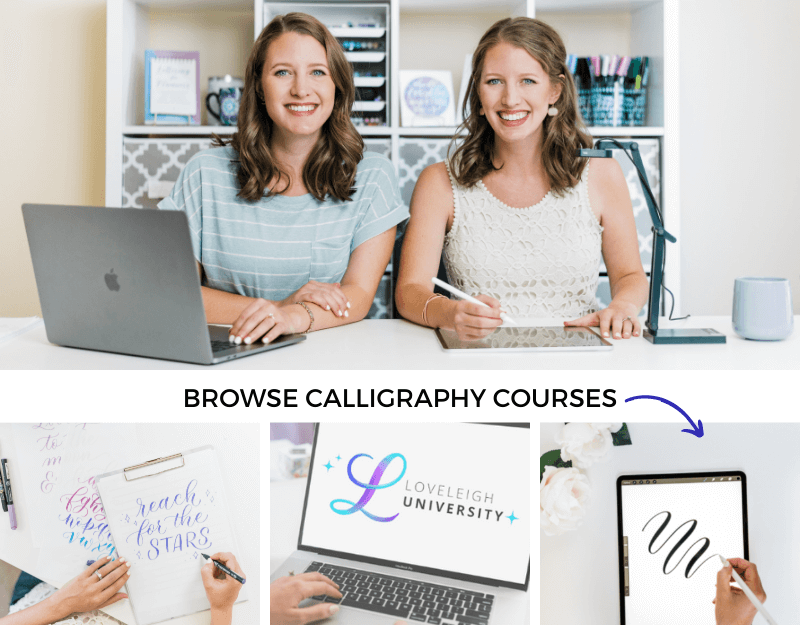
August In 8 Different Calligraphy Styles
Time to look at 8 different ways to write August in calligraphy! Follow along in our video tutorial for more details, tips and insights into these styles.
Pin it for later! ↓

August in 8 different lettering styles
Faux Calligraphy
This beginner-friendly style of hand lettering is perfect if you want to start writing without having to learn any special calligraphy techniques.
Where the basic strokes are all about creating thick and thin lines as you're writing letters, faux calligraphy lets you skip the learning curve of a calligraphy pen and instead draw this contrast. Simply draw a parallel line where the "shade" (thickness) goes!

August in faux calligraphy
After you write your letters, draw a line parallel to every downstroke while keeping the following in mind:
Shading goes on the inside of the curve (the "s" has shading on the left)
Overshading looks clumsy so have your shading taper before it reaches the baseline
Easy tip: If you want to leave your parallel spaces open, then make sure you plan your letters out a little before you start writing. For the letter "g," make sure to leave a gap between the oval and the beginning of the letter "u" (follow along with our video to see this explained in more detail).
Learn more in our free faux calligraphy course:
Brush Lettering

August in brush lettering
A modern brush pen lets you do real calligraphy. With a brush pen, you can apply pressure to create the contrast between thick and thin lines. For this example of August written in modern brush lettering, we're doing each letter in true calligraphy style.
While you may find that using a brush pen comes with a bit of a learning curve, just give it time. With some time and practice, anyone can learn! We have free worksheets to help you practice:
Bounce Lettering

August in bounce lettering
Bounce lettering is a fun way to add some frivolity to your hand lettering. Rather than planting each letter firmly on the baseline, bounce lettering lets you dip certain parts below the baseline.
Easy tip: Use letterforms that are more round for an organic, playful look and feel.
Where do I bounce? Any letter that touches the baseline in more than one place is a good candidate. In the month of August, that means:
A: Dip the underturn below the baseline
U: The second underturn is very bounceable
S: Normally not a great candidate but the letterform that we've written lets you still bounce it
Despite its playful look, bounce lettering is not random. Check out our guide on bounce lettering for the ins and outs:
iPad Lettering

August in digital calligraphy
Digital calligraphy is amazing and the Procreate app comes packed with countless features to help you learn and experiment.
Here we're using our free color-changing brush to write August. While you can try to write with any brush, our color-changing brush helps you learn pressure control and also makes your writing look beautiful instantly!
We teach iPad calligraphy for beginners in our free course:
Copperplate

August in Copperplate calligraphy
If you're looking for a more traditional look, the historic Copperplate style is perfect.
Although it comes with a bit of a learning curve, pointed pen calligraphy isn't as intimidating as it looks.
Here are a few pointers that will make writing easier:
A: The long upstroke is tricky so consider turning it into a thin downstroke. This one is even difficult for experienced calligraphers so don't feel bad if it's difficult!
U: Extend the second underturn of the "u" to better connect with the following "s"
G: Make sure your loop is both long enough and not too thin
T: Think of this letter as simply an underturn that starts a little higher
You can start practicing the elegant Copperplate style with our free worksheet:
Flourished Copperplate

August in Copperplate flourishes
Why not make your lettering even more elegant by adding embellishments? Adding flourishes is a great way to give your calligraphy that wow-factor it deserves.
Here are three places to add decorative lines in the word August:
Capital A: This is also a great way to modify that difficult, long upstroke!
G: Add some drama by extending the loop
T: The crossbar works especially well for flourishing
Easy tip: Flourishes can make your composition unreadable so take some time to plan them out in advance. Using pencil first lets you experiment with different designs without undoing all of your hard work.
Dive into flourishing with our free course:
Spencerian

August in Spencerian script
The 19th-century Spencerian script provides a more restrained traditional calligraphy style to write August.
Besides being written at a different slant from Copperplate, Spencerian has letters that are a little less rounded and have less shading.
For August, only add shading in the following letters:
A: The downstroke in the oval
G: The oval (or loop)
T: Only the top of the stem
While the refined Spencerian script lacks the drama of Copperplate calligraphy, it works amazingly well on the iPad. You can try for yourself with this iPad Spencerian traceable practice sheet:
Flourished Spencerian

August in Spencerian script flourishes
Like Copperplate, adding a few decorative lines and embellishments to your Spencerian "August" can really make this month come to life. Keep in mind that Spencerian is a more refined and stately style, and your flourishes should reflect this.
The following letters are a great place to add flourishes:
A - capital letters deserve all the drama they can get
T - embellishing the crossbar is a great way to finish this word
Other Months Of The Year
Writing the months of the year is a fun practical application for calligraphy. Here's a round-up of all of our tutorials! The italicized months haven't been published yet, so check back!
Pin it for later! ↓

August in 8 different calligraphy styles
Next Steps
Don't let this be your only visit to Loveleigh Loops! Come back every month for a daily challenge or new tutorial, or sign up for any of our free worksheets or courses. We're SO glad that you stopped by today, and we can't wait to support you on your lettering journey!